Cap Shot, a bold new energy shot, set out to make a name for itself in a saturated market by tapping into a unique flavor twist: heat. Targeting a youthful, adventurous crowd that craves both energy and excitement, the brand needed a visual identity that captured its fiery personality and stood out on shelves and screens alike.
Solutions:
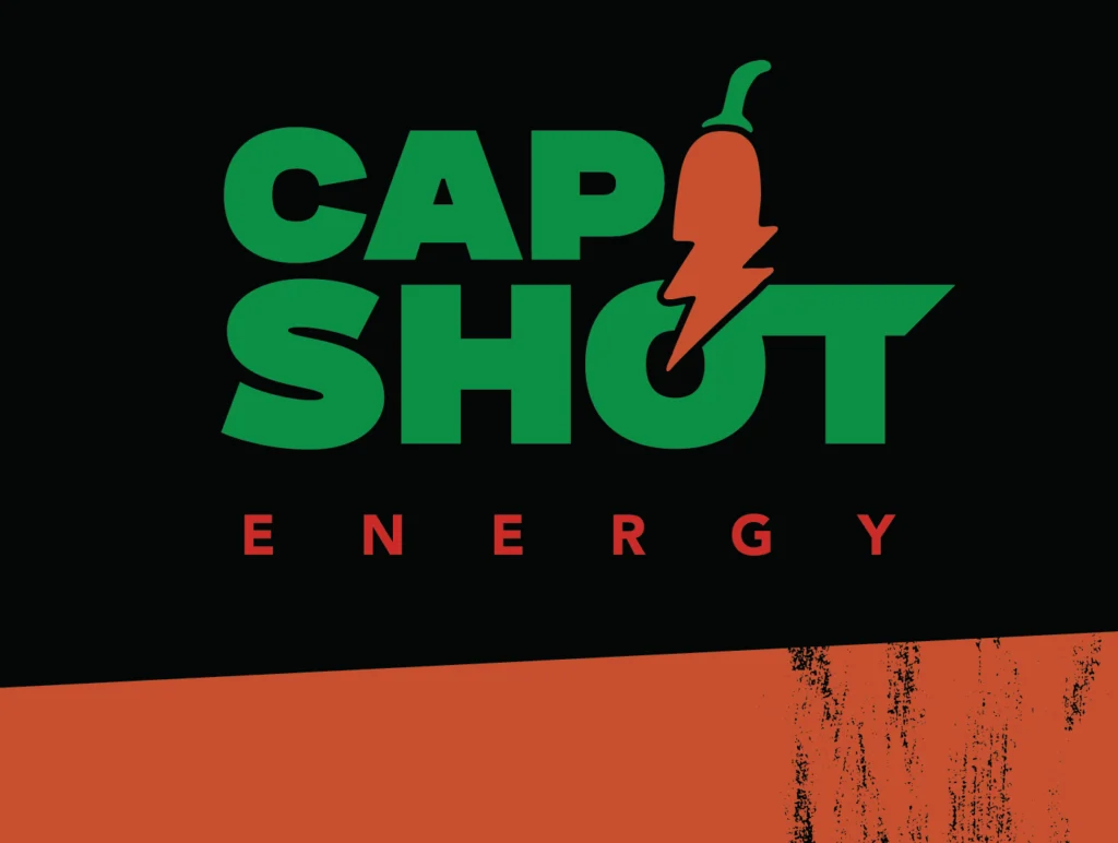
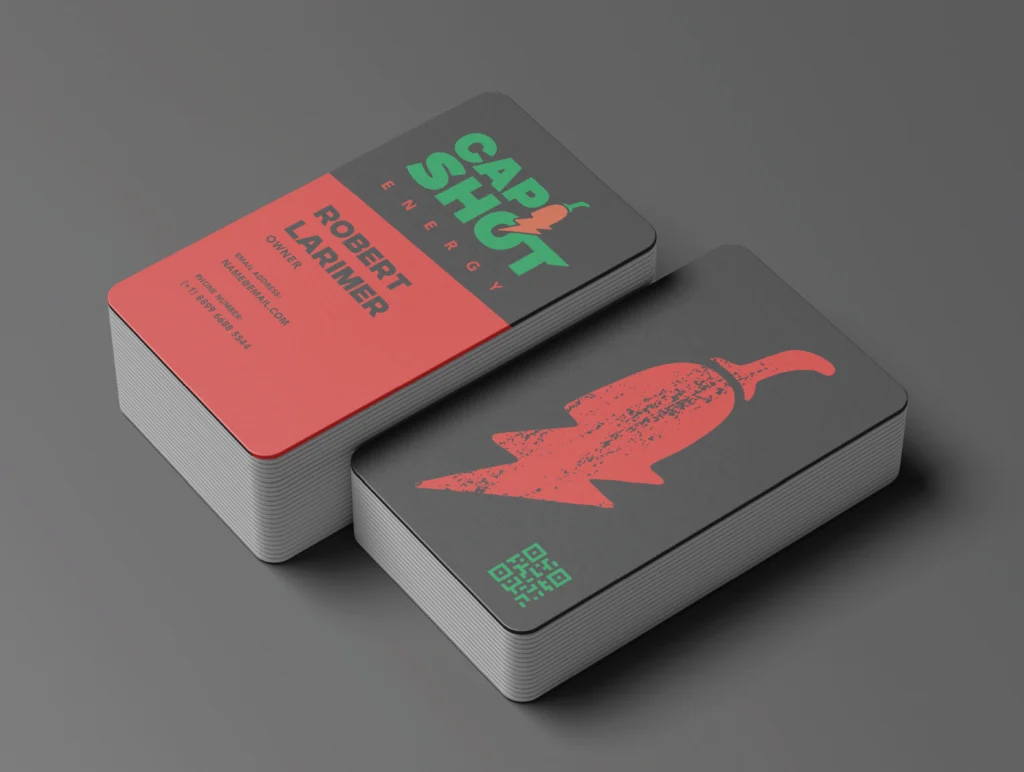
To position Cap Shot as the go-to drink for spice lovers and thrill-seekers, I created a visual identity that leans into intensity, heat, and high energy. The brand visuals fuse edgy typography with striking iconography, evoking movement, adrenaline, and the punch of capsaicin. From logo to color palette, every element was designed to spark curiosity and fuel community connection around this one-of-a-kind shot.
The Process:
Audience-Focused Design: Researched visual trends in both the energy drink and spicy food markets to build a brand that would resonate with Cap Shot’s core audience—young, bold, and up-for-anything. Visual Identity: Developed a logo system with sharp, dynamic forms and flame-inspired accents to signal energy and heat. Typography & Color: Crafted a vibrant color palette and typographic system that balances gritty edge with legibility—perfect for packaging, social, and merch. Packaging Concepts: Explored product design options that communicate flavor and impact at a glance, helping Cap Shot compete on crowded shelves.
Deliverables:
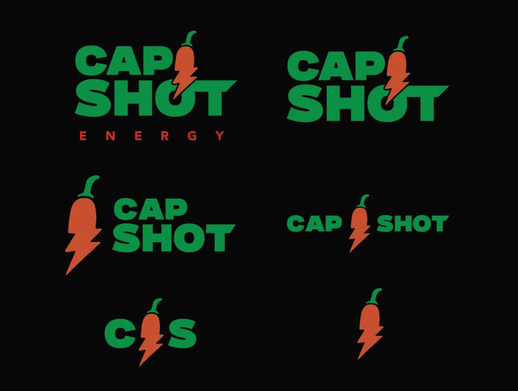
Responsive logo suite
Custom brand typography and color palette
Full brand guide detailing usage, tone, and positioning
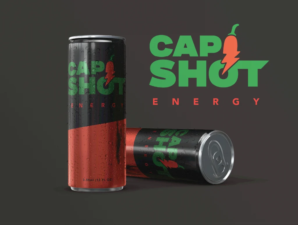
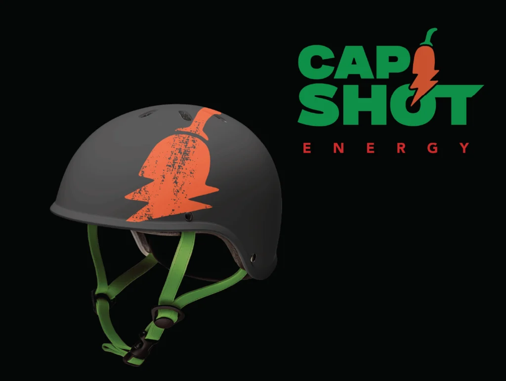
Packaging and product mockups for future development
Results:
Cap Shot’s refreshed visual identity gave the brand a strong foundation for growth, immediately grabbing attention and building excitement around the product launch. The design’s bold aesthetic and clear point of view helped Cap Shot stake its claim in the energy market—winning over early fans and paving the way for expansion.