The Middle Wellness is a well known massage therapy brand in Grand Junction, CO. The existing brand was light and airy with a sort of watercolor treatment over topographic patterns to make a “M” and “W”. After a discovery meeting we realized we needed something more versatile and bold to reflect the future vision for the company
Solutions:
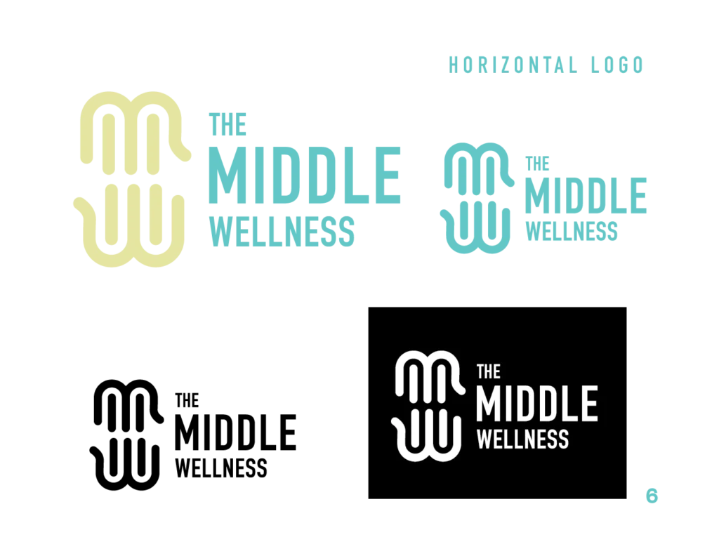
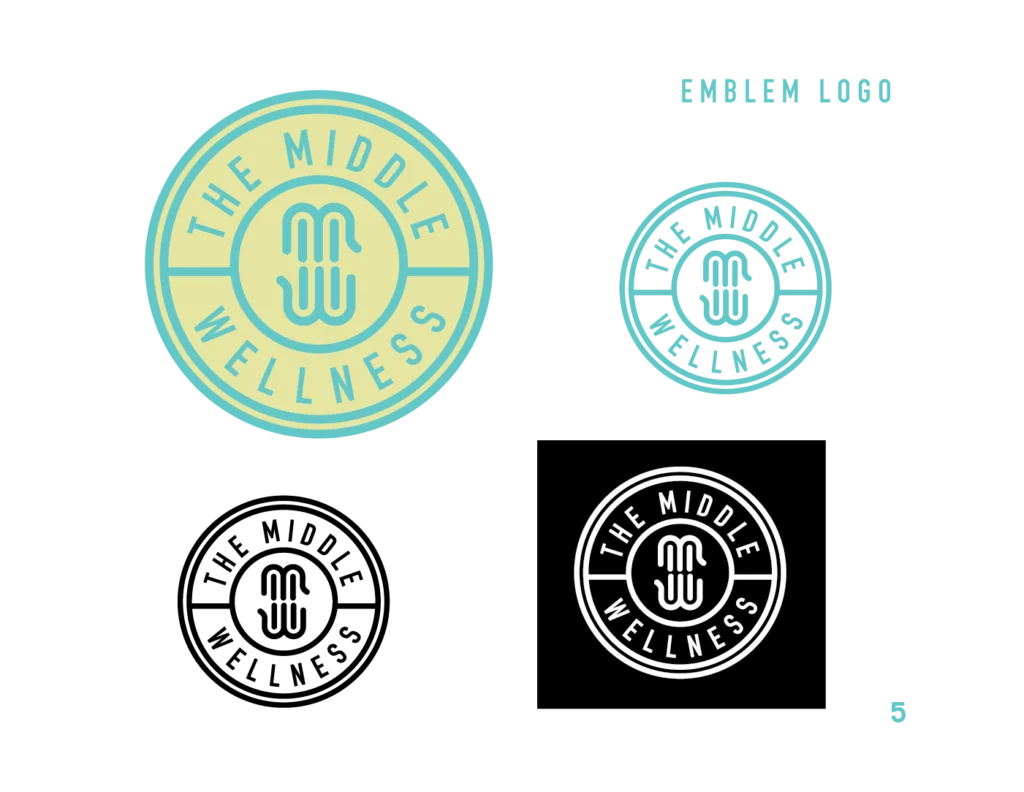
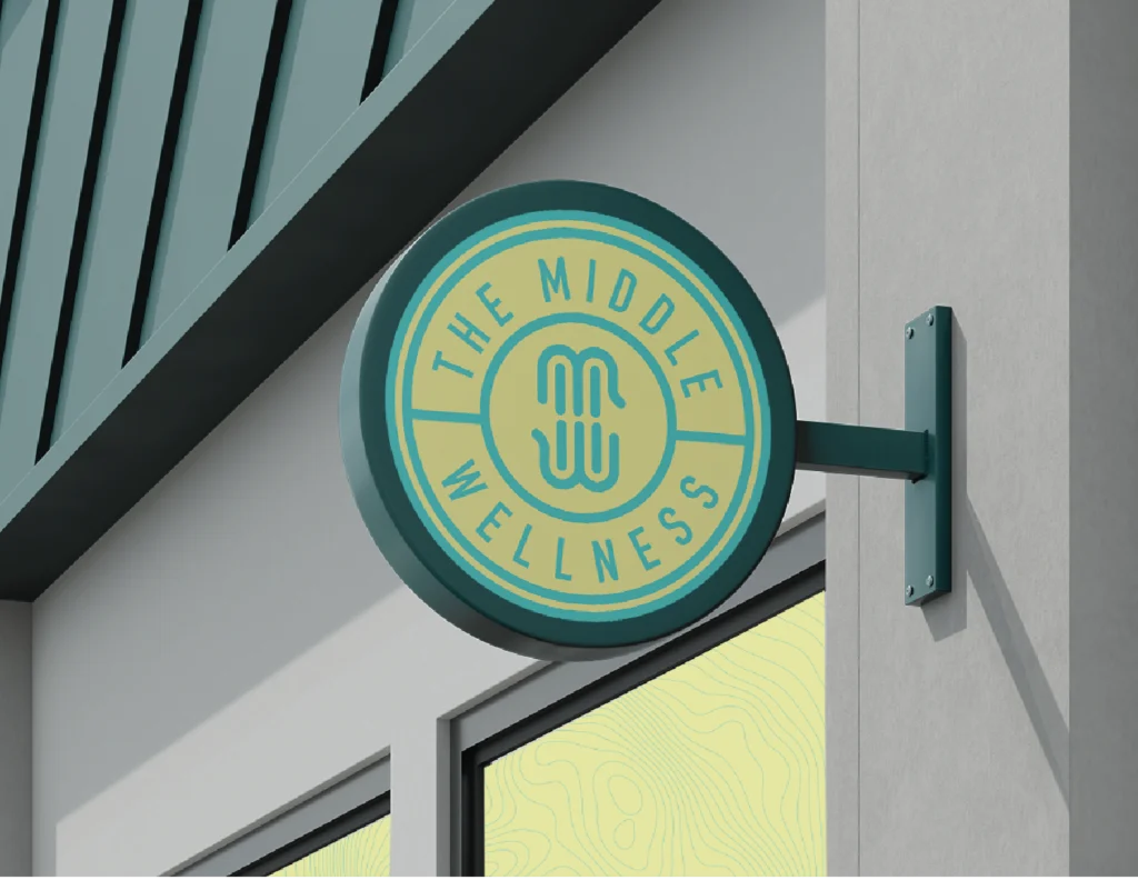
Upon discovering that a strong symbol for the brand was an elephant, I created letter mark that subtly resembled a combination of an elephant and two hands (for massage) creating the “M” and “W”
The Process:
Concept Development: sketched a variety of hands and elephants to create a bold new look
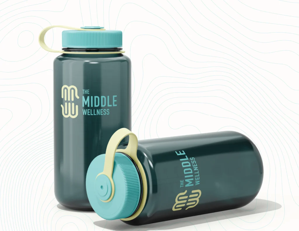
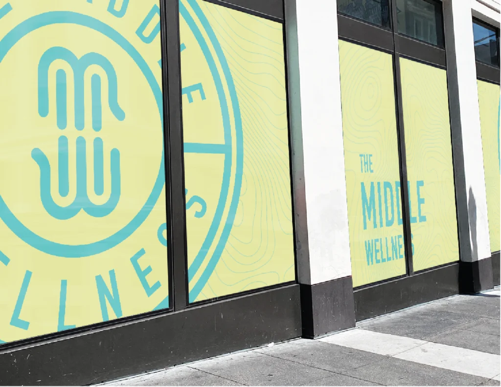
Versitility: Build multiple responsive logos so that it can be used on any campaign
Color Variations: Created 2 color pallets to differentiate from her B2C and B2B marketing initiatives
Deliverables:
Comprehensive visual brand guide for B2B market
Comprehensive visual brand guide for B2C market
Files
RESULTS:
The Middle Wellness moved locations, launched their B2B campaigns (marketing to other massage therapists for training) and launched the new brand with enthusiastic feedback from the community.